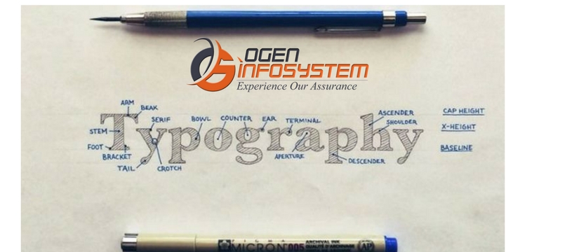
Want to master the art of typography? Website designing company in India is continuously trying their best to make a typography that user appreciates and feel easy to navigate. Communication is the key to create a long-lasting impression in the mind of users. While talking in terms of web designing, communication usually refers to the text that helps in bringing conversions. If your web design has a good typography then visitors will be able to read your text effortlessly. A good web design typography contributes to better UI design. Follow the below tips in order to improve the legibility of your site content.
1- Use Minimum Fonts
Keep the number of fonts at the minimum. If you use more than three fonts then it gives an unstructured and unprofessional look to your website. Excessive used font’s styles and sizes at once can also ruin any layout. It is advisable to use only single font possibly in the entire website. In case you are using two fonts then ensure that they are in contrast. As using two fonts that is quite different from each other might clash.
2- Avoid Using Blinking Text
Content that winks or glisten makes the user capture your text forcefully. It has a bad impact on eyes too and they easily get distracted and annoyed with the blinking text.
3- Avoid All Caps
According to Miles Tinker, capitalizing the entire paragraph interrupts the speed of scanning and reading as compared to lower-case type. Don’t use capitalized letter in the whole text. Capital letters are fine where you need to give some more focus such as headings or titles, logos, and acronyms. But when your message is more about reading then avoid using all caps text.
4- Properly Use White Spacing
For creating better impact of your website embrace white space as an element. Using white space properly in your text will enhance comprehension up to 20%. In order to make your text more readable, it is advised to stretch or compress the space between letters. As in the below image, the text is aligned in blocks for better legibility.

5- Limit Line Length
To give your audience a good reading experience, use around 60 characters per line. Use 30-40 characters per line for mobile devices. Limit your text blocks width using em or pixels in order to attain an optimal number of characters per line.
To give a completely fresh look to your website ensures to use the right typography. For professional looking website design contact the leading website development company in India.