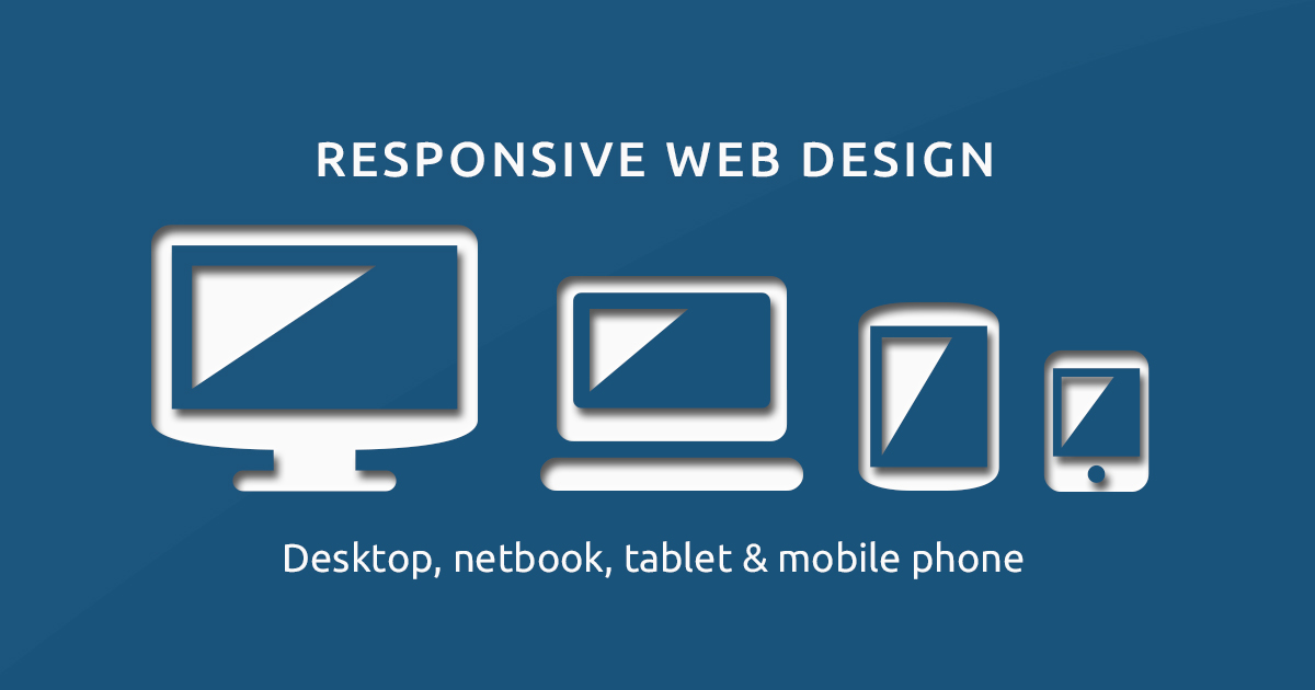
Today more than 55% of the internet users browse on the mobile devices. So, it becomes essential that your website performs well on both the desktop and mobile. A responsive website is a smart way to ensure smooth functionality and security for the hand-held device. Here are 10 amazing facts that you need to know about responsive web design.
1- Affordable Cost
Website Designing Company in Delhi provides the responsive website design at the affordable price that helps you to save time, money and energy involved in developing a separate website. You can easily optimize your responsive website for all devices. Responsive site minimizes the time and cost of the development.
2- Best User Experience
As discussed in the above point responsive website can be optimized for any kind of device. A responsive website adjusts according to the screen size automatically and users get the same level of interaction with the site in smaller screen size as well which they are expecting to get in larger screen size.
3- Website Performance and Loading Time
Google gives priority to fast loading websites. People also love to explore the sites that open swiftly without taking much time. If you want to have a better performance and faster loading time for your website then there comes the need for a responsive site. Responsive web designs load quickly and provide a better viewing experience and performance on all devices. Hence, it helps in reducing bounce rate.
4- Less Maintenance
As in case of responsive web design you no need to develop a separate website that means you have to maintain only on website thus reduces the maintenance work for you.
5- Boosts ROI
Responsive web design eliminates numerous problems relevant to the performance, functionality, look, and feel of your website. Thus increases you return-on-investment.
6- Similar Desktop & Mobile Features
The features, as well as the content of a responsive web design, depicts similar in both the desktop and mobile. It remains same whether you see it in 1800 pixels or 320 pixels. The look same in terms of design as well as in terms of content.
7- Increased Users of Mobile Devices
More than half of the internet users turn up on mobile gadgets. People access the internet more using smart phones or tablets. The high demand for using internet on the mobile devices creates the need for web developers to build a responsive website that can perform and function well on various devices and screen sizes.
8- Search Engine Optimization
A responsive website is additionally a great advantage to rank higher in the search engine results. Besides boosting your site ranking in various search engines it also helps in growing your website traffic. SEO Service in Delhi assists to rank your responsive website at the top of the Google.
9- Responsive Site Improves the UX
For offering your users with a rich experience on both desktop as well as on mobile you need to create your website that is fully responsive. A site that is responsive enables users to feel the better experience while accessing your website. It improves the user experience as the users need not pinch the screen in case of a responsive web design.
10- Single Design Sufficiency
There is no need to create a separate website in case of a responsive web design. A single site is enough for all screen sizes. This decreases a great burden on designers, developers, and webmasters.