
Most of us have been stuck into any app or website that led you into a dead end after moving through a smooth process from the beginning. This leads to lots of confusion from designer prospective and increases irrelevant clicks. It can also annoy to some of the visitors, as everyone needs hassle-free process till end.
Let us discuss in detail one of the commonly disregarded but eminent factors of website design also called as the Empty States and its impact on customer acquisition.

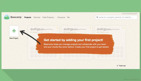
An empty state, or zero-data state, is an afterthought idea for many designers. The thing you design last, it’s a temporary or minor part of the client experience.
However, don’t be tricked by the name. Empty states are in reality brimming with potential to drive engagement, enchant clients, and hold clients at basic minutes like when somebody downloads the app, clears out their content, or runs into an issue.
Any user encounter empty states in their first use, user cleared, and errors. But usually designers make mistake by assuming that these situations have very less to do with user experience. In actual, it has the potential to retain visitors and provide them a delightful experience. User sees an empty state as no data availability or error in the app or website. For many users, first impression is the last impression and after going through empty state, they might never visit the app again.
How a designer deal with the empty states, leads to either Enhance in the user activity and retain the visitor, or temporary / permanent abandonment of the app and getting negative reviews.
Users try out many apps but decide which one to continue and which one to uninstall in first 3-7 days. An average app loses 75-77% of its users within the first 3 days of installation. The major success would be to get user retained during those 3-7 days of critical period. The similar conditions are for desktop clients & websites.
Now the question comes, how can you ensure an empty sate is helpful to you. Designer should start thinking from the user perspective and think what should a user like to see in an empty state.
- Educate the user: it should tell the user, what it’s for, why they are seeing it, and how can they utilize it or fill it up. While designing your empty states, keep these three questions in mind.
- Delight your user by grabbing their attention: Educating users with the above questions will help you to retain the users, but users make snap judgments about the time they’ll invest to explore an app. So, every little detail counts in convincing a user to give your product a fair chance. Designers need to find out how can they derive user attention and keep them engaged. You can do something fresh & unexpected, make user crack a smile with your creativity, or give good taste of the brand experience.
- Make prompt action for users: Making a good first impression is important, but true success in your first empty state means driving an action. Make your user want to fill that screen. You can provide a link for a landing page from where they can actually start their journey. While remaining minimal in design, a successful screen will explain a specific feature, reiterate the value proposition of that feature and then compel you to take the next step.
To prompt action on an empty state, 3 main components are required- Motivate, Persuade, and Direct.
- Incorporate motivational language and design that’s appropriate for your target audience, such as: “Get started now!” or “Let’s do this.”
- Value propositions aren’t just for landing pages. Remind the user of the benefit they will receive when they interact with your product.
- Recommend and show them the single best way to get started. Provide a CTA button or point to the desired action with an arrow. This is not the best time to give users options. Also, make it as easy as possible. If getting started requires that the user create content, give them some initial content they can borrow.
Once you are done with these, do add flavour to your app you need to work on personality factor, i.e Turn your app into a delight for people and here you can make smart utilization of the features to connect with feelings.
These are some of the most important aspects of the Empty states that you need to start implementing today. The best part of design is often the most challenging—the interfaces that require a delicate balance of information and action. But, given that a empty state is what could stand between your user and the incredible UI work you’ve done, don’t these screens deserve a little more of your time and attention?