





 Reason 01 of 05
Mobile-First, Not Mobile-Later
We sketch the phone layout before the desktop one. Content priorities are decided for the smallest screen, so nothing important gets buried when space is tight.
Our Expertise
Google indexes the mobile version of your site first. A responsive design with clean structure, fast loading and structured data is the foundation for ranking on Google, appearing in answer engines and being cited in generative search.

We engineer your website to rank on Google (SEO), appear in answer-engine results such as Perplexity (AEO), and get cited in Google's Generative Search results (GEO). Three search channels. One website. Maximum visibility.
We write and structure your content so answer engines like Perplexity can extract, cite, and present it to users asking your customers' exact questions. Your brand becomes the answer — not just a result.

Google's generative search results pull content from authoritative, well-structured pages. We build those pages for you — with schema markup, E-E-A-T signals, and topical authority that generative engines trust and cite.
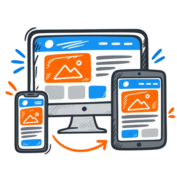
From a 375px phone to a 4K monitor, your site renders perfectly and passes Google's mobile-first index — the foundation every other ranking signal sits on.
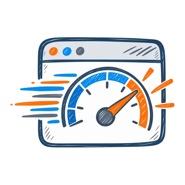
INP under 200ms, LCP under 2.5s, Lighthouse above 90. Image compression, lazy loading, and CDN delivery as standard.

FAQ, Article, LocalBusiness, and Product schema coded into every page — the structured data that feeds Featured Snippets, voice search, and generative answers.
A direct answer for business owners asking why their website needs to work on every screen.
Responsive web design is an approach where one website automatically adapts its layout, images and text to the screen it is viewed on — phone, tablet, laptop or large monitor.
Instead of building a separate mobile site, a responsive site uses fluid grids, flexible images and CSS media queries so the same page rearranges itself to stay readable and easy to use.
A responsive web design company in India designs layouts for multiple breakpoints, builds them with modern CSS, optimises images and speed for mobile networks, and tests on real devices before launch.
At OGEN Infosystem every website we have built since mobile-first indexing has been responsive by default — not as a paid extra.
Watch the same page reflow from desktop to tablet to phone — then drag to see what a non-responsive site looks like on mobile.
Clear message, one obvious next step, and pages that load in a blink.
Book a Free CallOne layout, three screens — the same page reflows automatically
Clear message, one obvious next step, and pages that load in a blink.
Book a Free CallMost of your visitors are on a phone. We design for that reality first — then make sure the same site looks just as sharp on tablets and desktops.
Reason 01 of 05We sketch the phone layout before the desktop one. Content priorities are decided for the smallest screen, so nothing important gets buried when space is tight.
 Reason 02 of 05
Emulators miss things. We test on real Android phones across price ranges, iPhones and tablets, in Chrome, Safari and Samsung Internet.
 Reason 03 of 05
Images in modern formats, responsive srcset, lazy loading and minimal JavaScript keep pages quick even on patchy 4G.
 Reason 04 of 05
Body text never drops below 16px on mobile, and buttons meet WCAG 2.2 target-size guidance so fingers hit what they aim for.
 Reason 05 of 05
When converting an old site, we keep URLs, metadata and redirects in place so you gain mobile usability without losing search traffic.

We review your analytics to see which devices, screen sizes and browsers your visitors really use — and plan breakpoints around them.
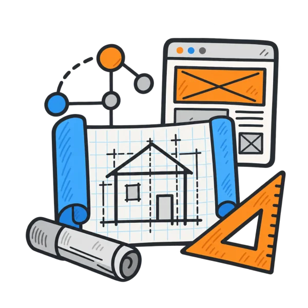
Content is prioritised for the phone first: what must be seen without scrolling, what can collapse, and what can move lower.

Layouts are designed at phone, tablet and desktop widths in Figma, using one shared component set so every size feels like the same brand.

Images are prepared in multiple sizes and modern formats, and text is written to stay scannable on a narrow screen.

We test on real devices and browsers, check Core Web Vitals on mobile, and fix layout shifts, overflow and tap-target issues.

The site goes live with performance benchmarks recorded, and we monitor Search Console mobile usability reports after launch.

Readable text and a layout that fits the screen stop people from pinching, zooming and leaving within seconds.

Google uses the mobile version of your pages for indexing and ranking — a weak mobile site drags down everything.

Tap-to-call, click-to-WhatsApp and short forms placed for thumbs turn mobile browsing into real conversations.

A single responsive site means one set of content, one URL structure and one place to update — not two separate sites.

Lighter mobile pages load quicker, which keeps people on the site and supports better Core Web Vitals.

Fluid layouts adapt to foldables, large phones and new tablets without a redesign every time screen sizes change.
of consumers compare multiple websites before making a purchase decision
increase in bulk orders was recorded due to improved website experiences
of businesses see higher engagement with a result-oriented website
of consumers prefer websites that are responsive and SEO-optimized
Ogen Infosystem's website design transformed our online presence. Their team's attention to detail and seamless user experience significantly boosted our customer engagement.
 Sneha Patel
Working with Ogen Infosystem was a game-changer for us. Their creative approach to our website design not only reflected our brand's aesthetics but also increased our online sales.
 Rajesh Kumar
We are thrilled with the results Ogen Infosystem delivered. Their responsive website design helped us attract more customers and streamline our online ordering process, enhancing our overall business operations.
 Amit Sharma
We align every service around one goal — measurable growth. Here's how we execute across each discipline.
We start by understanding your audience, brand positioning, and business goals before a single pixel is placed. Design follows strategy — not the other way around.
Every layout is built from scratch — no templates. We craft visual hierarchies that guide visitors toward action, whether that's a call, a form, or a purchase.
With 70%+ of traffic on mobile, every design we deliver is tested across devices, screen sizes, and browsers before sign-off.
We apply proven UX patterns — clear CTAs, trust signals, social proof placement — to ensure your website works as hard as your team.
We select the right architecture for your project — React + Next.js for high-performance SSR, Laravel for robust back-end APIs, or headless CMS setups. Every recommendation is based on your scale and growth trajectory.
No purchased themes. No black-box page-builders. Every line is written by our in-house team and delivered with full documentation.
We build with LCP, INP, and CLS targets met from day one. HTTPS, input validation, and OWASP mitigations are standard, not extras.
Platforms we build are structured for edge deployment and serverless scaling — so you are not forced into a full rebuild as traffic grows.
We help you choose between native iOS/Android and Flutter cross-platform — balancing performance, budget, and time-to-market.
We build interactive prototypes so you validate every user flow and eliminate costly scope changes before development begins.
Secure, cloud-native backends built to scale from 1,000 to 1,000,000 users without a rewrite.
We handle full App Store and Google Play submission, ASO metadata, and post-launch performance monitoring.
We identify and fix crawl errors, page speed issues, broken links, duplicate content, and schema gaps silently dragging down your rankings.
We map keywords to buyer intent stages so you capture visitors who are ready to act, not just browse.
Title tags, meta descriptions, heading structure, internal linking, and content depth — all tuned to current algorithm requirements.
We earn backlinks from relevant, high-authority domains through outreach — no PBNs, no spam, no risks to your domain.
We map your customer journey from awareness to purchase and build campaigns that engage people at every stage.
Google Ads and Meta campaigns with laser-focused targeting, A/B tested creatives, and weekly optimisation.
We analyse heatmaps and funnel drop-offs to find where visitors leave — then fix it systematically.
Transparent dashboards showing impressions, clicks, leads, and revenue — so you know exactly what your investment is producing.
Instagram, LinkedIn, Facebook, YouTube — strategies built natively for each platform's algorithm and audience.
We plan, design, write, and schedule posts — consistent, on-brand content without pulling your team from core work.
We monitor comments, DMs, and mentions — responding quickly to build trust and catch reputation issues early.
Reach, engagement, follower growth, and click-through tracked monthly with clear recommendations.
Every piece is built around keyword research, search intent, and on-page SEO — so it ranks and converts.
We match content to writers with domain expertise in your sector — no generalist fluff.
Blog posts, landing pages, product descriptions, case studies, whitepapers, and email sequences.
Every piece is original, checked against plagiarism tools, and reviewed by a senior editor before delivery.
WooCommerce, custom PHP, or headless e-commerce — the right architecture for your product count and scalability needs.
Razorpay, PayPal, Stripe, and UPI — seamlessly integrated with security, refund flows, and failure handling.
Real-time stock tracking, order updates, and admin dashboard — everything you need to run operations at scale.
Cart abandonment reduction, one-click checkout, and trust badge placement to increase average order value.
We map user roles, workflows, data flows, and integration requirements before writing a single line of code.
Multi-level permissions, secure login, and audit trails — built for B2B portals and enterprise dashboards.
CRM, ERP, payment, logistics, and communication APIs — full integration lifecycle including error handling.
Built to handle thousands of concurrent users and future feature additions without a full rebuild.
Our experts are dedicated to your success — get a free 30-minute strategy session and walk away with a clear action plan.
Our expert listens to your idea and crafts a personalized, effective development roadmap just for you.
We deep-dive into your vision, then build a strategic cost-effective plan to maximise your brand's potential online.
Book at a time that works for you — no time limits, no pressure. Just click below and pick your slot.
Responsive web design is an approach where one website adapts its layout, images and text to any screen size — phone, tablet or desktop — using fluid grids, flexible images and CSS media queries.
OGEN Infosystem is a responsive web design company in India, headquartered in Noida and building websites since 2013. Our responsive web design services include mobile-first design, responsive conversion of existing sites, touch-friendly interfaces, mobile speed optimisation and real-device testing — so your website works properly on every phone, tablet and desktop. Browse our portfolio, explore website designing, or contact us for a free mobile usability check.
Last reviewed: 26 Oct 2026
